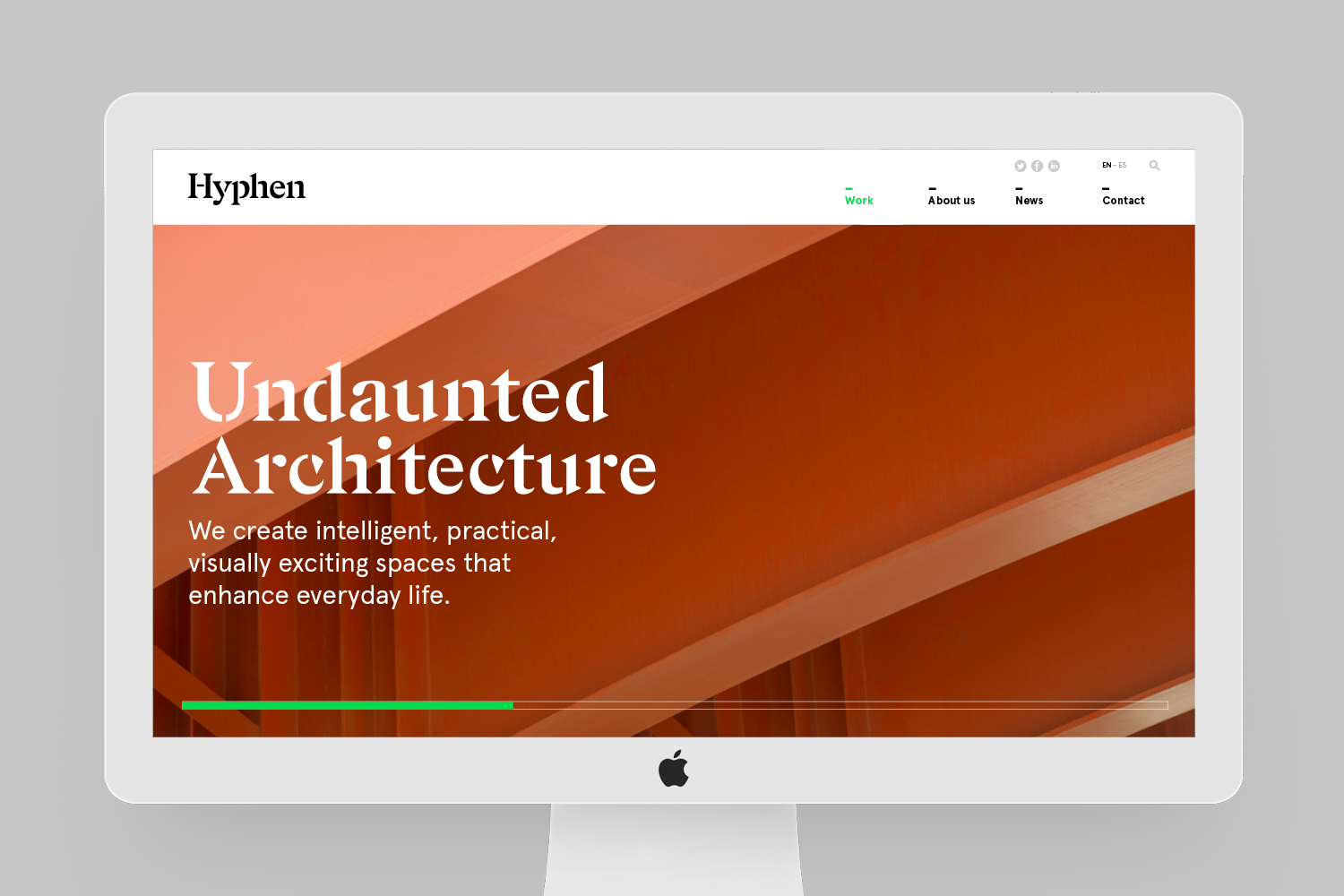
Hyphen
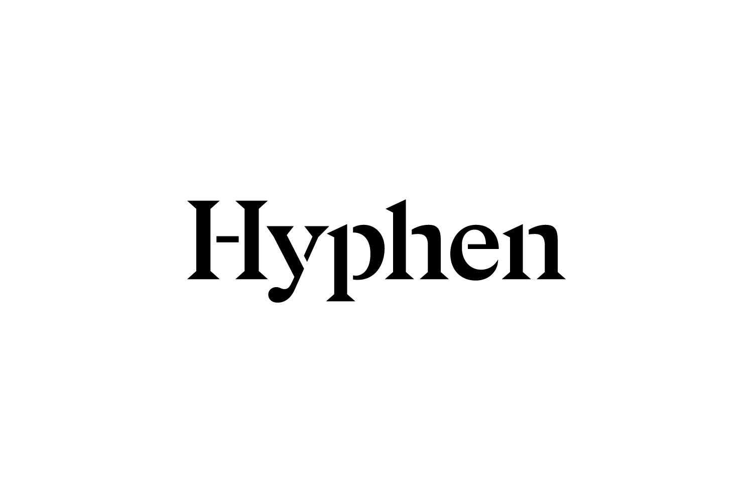
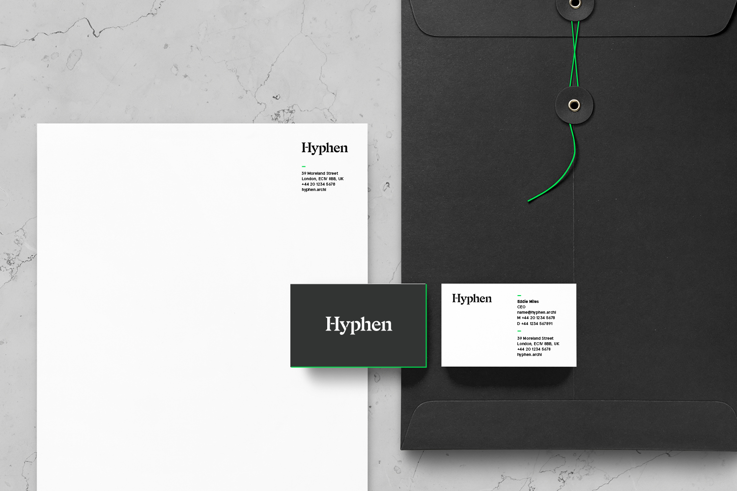
Brand identity for global achitecture firm Hyphen.
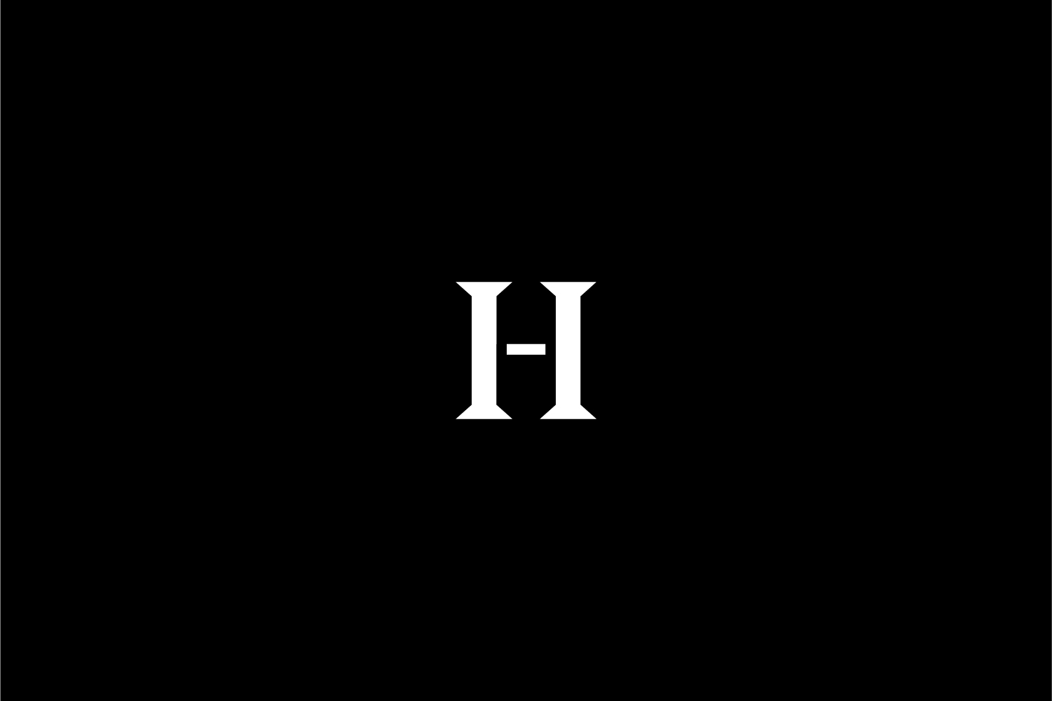
A crossbar in the initial letter H of the logo denotes its name and emphasises the connection between their branches as a global firm.
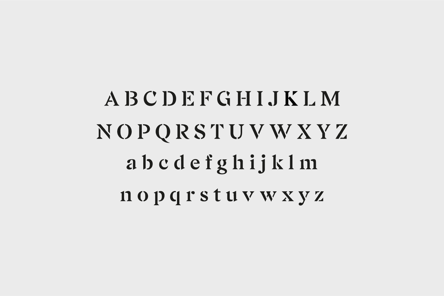
We also developed a stencil alphabet set based on typeface Gza for Hyphen’s modern serif wordmark and primary type use.
Find out more about this project
Brand identity for global achitecture firm Hyphen.
A crossbar in the initial letter H of the logo denotes its name and emphasises the connection between their branches as a global firm.
We also developed a stencil alphabet set based on typeface Gza for Hyphen’s modern serif wordmark and primary type use.
Find out more about this project
Client: Hyphen
Agency: Pentagram London
Creative Director: Angus Hyland
Associate Partner: Rhian Edwards
Designer: Jiyeun Sung